Feature Iteration Fatigue

published on
TL;DR: What was meant to outline the annoyances with the many frequent app updates, turned into a rather lengthy opinion about Netflix’s latest UI changes.
Almost every day I see a few app updates for my iPhone, since I don't have automatic updates turned on, mainly for the reason that I like to know what is being updated and what new features are being introduced and which bugs have been fixed.
I have mentioned it before, but many times and for many apps, the release notes are so meaningless. (This also goes for websites, but of course with those you’ll hardly get release notes or other times don’t even notice the changes.)
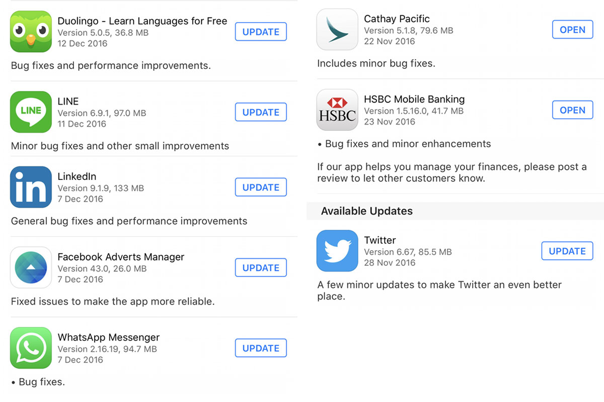
I do understand that most users probably aren't really interested in what has changed, but if a developer (or whoever might be in charge) makes the effort of writing release notes in the first place, you might as well put some meaning into it. I'd prefer anything over 18 app's updates only telling me "improved performance and bug fixes".
I usually install all updates and many times I'm surprised by what has changed. Unfortunately quite often, instead of an improved experience, the update delivers an experience that isn't even as good as it was before. Slightly subjective? Yes.
In German, there is a nice word for this: “Verschlimmbesserung”.
It's hard to translate this word, but to keep it simple, it's a mix between “Improvement” and “worse”. You could say, “Improvement for the worse”.
I’m well aware that this is a fairly subjective view, but I’m sure that I’m not alone with it. Two examples that I have recently come across with exactly this happening, are Skyscanner (on the iOS app) and Netflix on the web.
At some point a couple of months ago, Skyscanner changed their filters. I can’t quite exactly remember how they solved it before, since it’s a little too long ago, but the one thing I do know, is that every time I use the filters, it bugs me a lot that I always have to confirm (apply) the filters first, and have to go through multiple screens to set them, to then return to the actual results. It’s just not the most convenient or fastest way to do this.
Another, more recent example is Netflix. A few weeks ago, they updated their web app UI. Prior to this update, one could easily get to the description or the ★★★☆☆ rating of a movie, by either hovering over the thumbnail or by opening an extra info panel that would slide out below the thumbnail, but letting you stay on the main listings page.
Unfortunately this has now changed. To get to a description or the rating of a movie, you now have to click on the movie, which then takes you straight to that particular movie to start loading/playing the video right away. You can then scroll down to read the description, view the rating or find other movies “like this one”, etc.
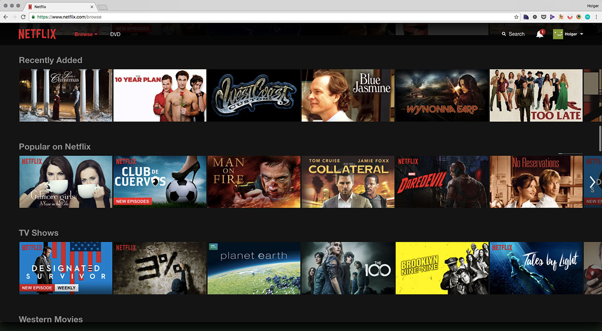
Since reading this very good advice, I usually let things sit for a little while before crying wolf. But the Netflix example bothers me every single time I’m watching a movie. I understand that the main point of this change might have been to get you to watch a movie much faster (And I have to admit, Netflix are pretty damn good at making movies buffer and start to play fast). This is absolutely great if you know what you want to watch.
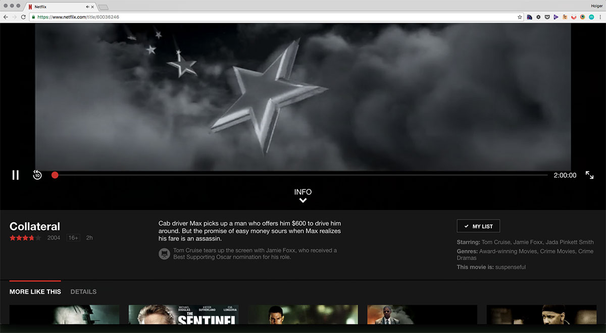
If you don’t know what to watch, this doesn’t make any sense to me at all. The main objective is to find something to watch, which in turn means that you want to be able to sift through as many movies as possible, in the shortest amount of time. A rating and a synopsis do really help in this process ;)
This is where I absolutely don’t understand the reasons for this change, since it makes searching and deciding for a movie a rather painful experience. In case you don’t have a Netflix account, here’s what you’ll have to do, otherwise you can give it a try:
- From the list view, select a movie and click on it.
- See the movie load (quickly!), then scroll down to read the synopsis or see the rating of the selected movie.
- Decide if this is the movie you want to watch.
- If so, rewind to the start of the movie in case it has been playing while you’ve been reading the description. (In most cases if you scroll down far enough, it will stop playing though.)
Otherwise: Go back to the main list on the previous page and repeat from step 1.
Again, this could be a pretty subjective opinion, but after working in the web design industry for quite some time, this just doesn’t feel right and should be a rather obvious flaw to any professional UX designer. I usually trust my guts. The other option could be that I’m just using Netflix the wrong way, but since I always held my iPhone correctly as well, I feel quite confident about what I’m doing there. I do have to say that the Netflix example doesn't quite fit snug into this article, since it's a web app and I don't have to "download" this update as with an app from the app store. Still, the basic principles of changing a user interface, adding features and such as I mentioned, still apply.
Coming back to where I started, the current times feel much more like a “race for new features” and product designers need to redesign things all the time, because consumers might expect things to change all the time. Maybe I’m a little old school, but I believe that when you have a good product that works well, there is no need to change things solely for the sake of change. Or even add things just to stay competitive. Maybe it's partly because users always think that more features are a better deal? Maybe I don’t know enough about the internals of successful apps and services and how they need to operate, but I’m quite sure that changes like these likely don’t improve the experience for a majority of users.
It might have something to do with design maturity, experience or even confidence. Maybe it’s just the times we live in. Maybe it’s a lack of research and testing. Or maybe it’s something completely else that I’m missing here. But competing on a “more features” basis has never been a good idea and some of the best products always convinced me by doing one thing well, and not by doing many things just so so.
I would prefer a little less updating in favour of thought-through design decisions (and some bandwidth saving that goes hand in hand with this) to save me from feature iteration fatigue.
Update: After I wrote this last week, I noticed that, over the weekend, Netflix has reverted to the previous design. I'm happy to see this, even though I have to admit some things now feel a little clunky, but over all, it's for sure the better version in terms of user experience.
Here are the screenshots of the newly reverted screens and I'm happy to see this.
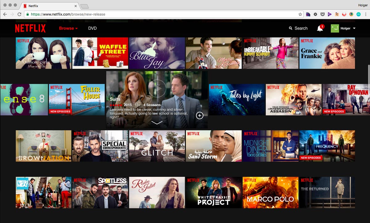
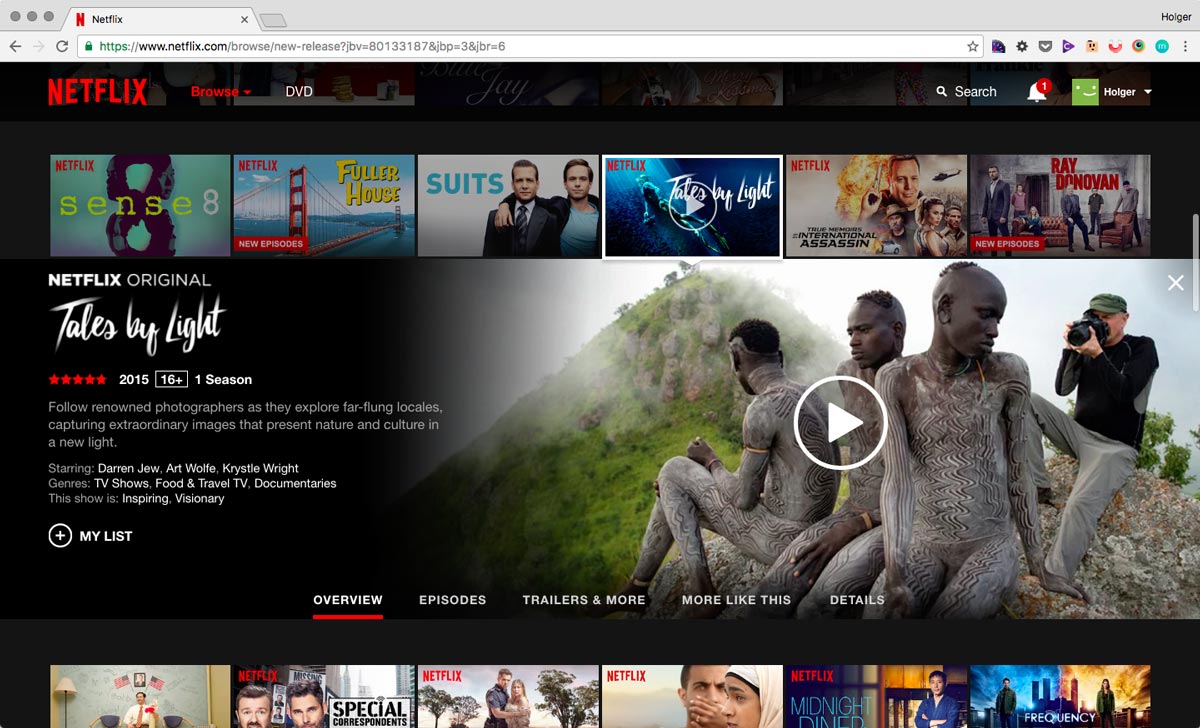
Interestingly enough, realising that "some things feel clunky now" makes me wonder how much of the new approach was actually a good direction and how it could have been improved. Testing on your live audience might work and get you the required data, but those results can come at the cost of your user's convenience. It's a double-sided sword and a tough decision to make sometimes.
Update 2: For the reasons stated above, I mainly like the reverted version more because it’s more convenient in terms of finding and navigating movies. After using Netflix for another night, I realised one thing missing that I preferred in the new design. The ability of clicking anywhere on the movie to pause and play. This has been possible in the new design and I thought it’s been a nice feature, which I would love to see being re-introduced. It’s important to see the iterations in full, which is sometimes hard to do without any change notes and by being a “normal” user. There’s usually more to an update than what meets the eye.