Improving Your Newsletter's First Impression

published on
Newsletters are one of the most popular marketing tools and many people and companies send them frequently. While it's fairly easy to set one up and get running, writing good content in general is a much more difficult task, especially for newsletters. Writing good content is one of the most underestimated things to do as well.
Not only does content have to be engaging and interesting, it has to get enough of your user's attention right away to stand out of the many emails in your inbox for one to even bother and open your particular email in the first place.
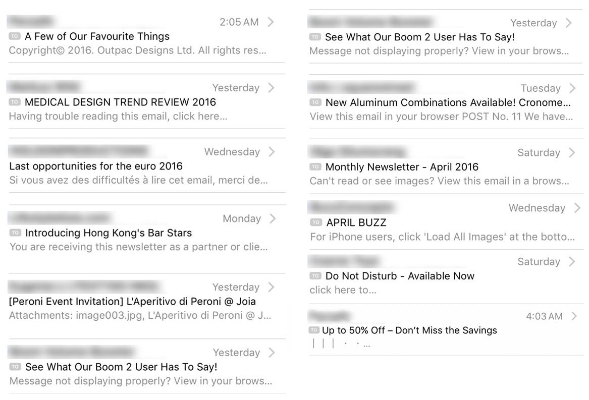
Something I have noticed over time, is that most newsletters I receive start with a variation of the same line of text: ”If this email doesn't display correctly, view it in your browser” or some random excerpt from the email's content.

Guilty as charged, I have previously done it, too. Even though this has been sort of a best practice for a while, I believe now it's about time for a change. Seriously, how many cases of “this email didn't display correctly”, in a way that it's really unreadable, have you come across?
Replacing this first sentence with something meaningful will improve the first impression and your user's experience a lot. This will especially make a difference when a user's preview is set to only show one or two lines of the email's content.
Making your first few words stand out and thus interesting enough for someone to open and read the complete email is a challenge, but the effort will be worth it. This relatively small extra effort will not only improve your users reading pleasure, but additionally might also have a positive impact on your conversion rates.