I recently came across the text-underline-offset CSS property and I’m really surprised that I wasn’t aware that this fairly new property existed. There have been many times in the past where I wanted some more spacing between the characters and the underline and in many cases, I would then fall back on border-bottom in combination with a little bottom padding.
I have been putting this newly found, little helper into good use a few times recently, and it feels like a great improvement. Not only does it improve the visual look, but I find that it makes the underlined word, which is mostly a link, much more legible.
This is how text-underline-offset looks like in action:
Ex 1: The fairy loved to dance on top of underlined letters
Ex 2: Other times it was possible to crawl between the offset
Ex 3: A solid underline made sure she would never fall and disappear
I’m not aware of any special guidance of text-underline-offset in terms of accessibility, but it serves as a nice addition to make text links a little more legible and easier on the eye, at least for some font choices, especially at small font sizes. Other than that, it also allows for some nice, creative possibilities to make things look a little more interesting.
Ever since Apple released macOS Catalina in 2019 and changed the default shell to zsh across its operating system, I’ve been meaning to follow this move and change my default shell from the good old bash to zsh.
With my current setup, I used a few lines from this profile to display the current git branch with the prompt. I never took the time to do some research and look into the topic, because all things shell is clearly not my comfort zone. Hence I also never found out how easy it could have been to get the same setup with zsh as I had all that time.
It seems that showing the git branch in Terminal is quite a common thing to do nowadays. I asked on Twitter and got some helpful pointers, and off I went into shell land.
I looked at Starship prompt, which works cross-shell, and with that I’m now running zsh as my default shell, inclusive of displaying the current git branch. Starship has a lot of options for configuration and you can easily pick the ones you need and like. It has a good documentation that without much time required, allowed me to add the options I wanted. After all, this wasn’t as scary or difficult as initially assumed.
I’ve switched my prompt to starship a few years ago and have found that largely eliminated any motivation to switch to zsh lol
That said, I’ve been doing fine with bash all those years and don’t use the shell to an extend that I’d notice all the advantages, but at least I got rid of the constant reminder of the new default shell and it feels like I’m up to date again.
I also found two more links that do the same without any additional tools, in case this is your cup of tea:
After some time, I eventually managed to unregister my service worker on this site, because I kept on running into fetch issues with Kirby’s panel API. I could not figure out what the exact issue was, so for now there won’t be any offline functionality anymore, but the panel will be working without problems for me again.
This article and this one helped me fix it, after I didn't manage to get it done at first try a few weeks ago. The final code block looks like this and went into the the footer of my site, instead of the registration of the same. The stumbling block for me was how to get to the registration of the current service worker, which navigator.serviceWorker.getRegistrations() returns. The script now unregisters the existing service worker from every visitor who had it previously installed, once they visit this site again.
if ('serviceWorker' in navigator) {
  navigator.serviceWorker.getRegistrations().
  then( function(registrations) {
    for(let registration of registrations) {
      registration.unregister();
    }
  })
}
Sometimes it’s a good idea to put things aside when you can’t get it done and revisit them later. Most of the time, the second attempt works much better and faster for me, since in the meantime the unconscious has pretty much done all the heavy lifting 😄
TIL how to remove empty array keys that don't hold any value, e.g. when passing multiple query parameters in an array via GET, the array_filter function will help to clean your array.
array_filter — Filters elements of an array using a callback function […]
Iterates over each value in the array passing them to the callback function. […]
If no callback is supplied, all empty entries of array will be removed.
In its simplest form, suitable for the use case from above, the array_filter function looks like this:
Previously I have mostly used toggling, adding oder removing classNames from a classList with JavaScript. As these names suggest, they work with classList.toggle('className'), classList.add('className') and classList.remove('className'). For a recent project, I wanted to empty the complete classList of all its className tokens, which made me wonder what the best way to do so would be.
Just like the ways to Rome, there are multiple ways to remove all of your classNames in a class attribute, which all yield the same result. Let's have a look at the possibilities:
First, it is possible to toggle a className, which removes the className if it exists and otherwise adds ist to the classList. Yet this didn’t solve my problem.
element.classList.toggle('is-hidden');
One simple way to completely remove all tokens is to set the class attribute with setAttribute to an empty string, like so:
element.setAttribute('class', '')
Another option is to iterate over all the classNames in the classList and remove the first className as long as classNames can be found. By looking at the following code, I’m not sure why I would pick this, just for the amount of code required. Yet it works absolutely fine.
var classList = element.classList;
while (classList.length > 0) {
   classList.remove(classList.item(0));
}
What I didn’t know is that with ES6, the spread operator (which consists of three periods) offers another simple way to clear a classList. The spread operator description says: “Spread syntax can be used when all elements from an object or array need to be included in a list of some kind.“ This is exactly what was needed in this case.
For my classList example with the spread operator, the syntax also is a one-liner, as compact as the first example above:
element.classList.remove(...element.classList);
From a quick search on the performance difference between setAttribute and using the …, it seems that the latter is slightly slower, but performance is not an issue for what I’m using it for.
I hope this has been helpful and thanks for reading this far. The documentation lists lots of other helpful cases for use of the spread operator, it’s worth checking out.
Update:
Thanks to Šime Vidas via Twitter here‘s the probably simplest one-liner that again does the same thing:
I was playing around with CSS transforms on an element with a border, where as a result the border would then overflow the page body. Usually this would not be an issue that the CSS property overflow couldn’t solve. To be more precise, in my case the correct property to use was overflow-x with the value of hidden to avoid horizontal scroll, since by using overflow: hidden the main page content, which is (likely) longer than the viewport, would stop scrolling vertically. And that would be bad.
After adding overflow-x: hidden to my transformed element, I started testing in different browsers. It seemed to work just fine, but after deploying I noticed that Safari and Chrome on iOS as well as Firefox, rendered the page with horizontal scrolling. I was a little surprised and at first, I thought that it had to be a bug with overflow-x.
I went on to check the examples on MDN and all of them worked fine in either browser. I then started to read the specification for the hidden value of overflow and there I found the solution:
hidden
This value indicates that the box’s content is clipped to its padding box and that the UA must not provide any scrolling user interface to view the content outside the clipping region, nor allow scrolling by direct intervention of the user, such as dragging on a touch screen or using the scrolling wheel on a mouse. However, the content must still be scrollable programatically, for example using the mechanisms defined in [CSSOM-VIEW], and the box is therefore still a scroll container.
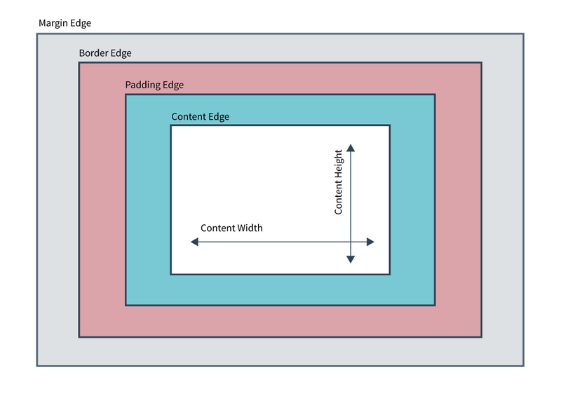
The specification says “fit the padding box”. To understand the problem, we need to take a look at the CSS basic box model.
When laying out a document, the browser's rendering engine represents each element as a rectangular box according to the standard CSS basic box model. CSS determines the size, position, and properties (color, background, border size, etc.) of these boxes.
Every box is composed of four parts (or areas), defined by their respective edges: the content edge, padding edge, border edge, and margin edge.
Diagramm of the CSS Basic Box Model
As visible in the above diagram, the border edge lies outside the padding edge and because of that, the clipping of overflow didn't work as expected. I then refactored the element to use a margin instead of border and it now works as expected. Another positive side effect of changing the border to a margin is that it removes some rendering issues (in Safari) on the border which can appear when an element is transformed.
An example of a rendering issue in Safari on a border when using transform skew
After so many years of working with CSS I didn’t think there was something new to learn about the overflow property, but oftentimes a language specification will surprise you in the most unforeseen ways ;) I recommend taking a peek once in a while, because there’s always something new to learn and it’s absolutely worth it.
After yesterday’s post on Digital Gardens and how to possibly arrange information, posts and all that in a better or more interesting and fun way, I started to try a few things. One of the approaches is to not list articles, notes and other things separately anymore, but instead list them all together, maybe with a marker for each type.
While trying to figure out how to best achieve this, I came across two helpful ways on how to do it in Kirby:
Option 1: $pages->add() which lets you add additional pages or collections to collections;
Option 2: $pages->merge() which merges one collection with one or more other ones.
I'm not even sure what the exact difference between the two methods is, since they do seem quite similar. I opted for $pages->merge() and the code in progress currently looks like this and works pretty nicely:
Today I read about the new CSS :is() pseudo-class function and at first thought, that it doesn’t seem helpful and all of what it does can already be achieved without it. I looked at some of the examples and it turns out that it can actually be quite helpful and in some cases much more convenient than the current approaches.
The new CSS :is() pseudo-class is shaping up to become a great way to target elements, saving on lines and lines of code, and keeping CSS as readable as possible. It is the next stage of the evolution of :matches() and :any(), adding a little extra functionality and increasing how semantic and intuitive the language behind selectors is.
This example from its MDN docs makes it quite clear how :is() can simplify the way we write CSS. Currently a lot of CSS looks like this:
section section h1, section article h1, section aside h1, section nav h1,
article section h1, article article h1, article aside h1, article nav h1,
aside section h1, aside article h1, aside aside h1, aside nav h1,
nav section h1, nav article h1, nav aside h1, nav nav h1 {
  font-size: 20px;
}
With :is() the above block can be simplified quite a bit:
Browser support for :is() is at around ~60% globally and a few browsers still require a fallback solution, but I'm looking forward to use this in one of my next projects to try it out.
I was working on a very simple “email this article as a recommendation” feature, where the user would click a link to open their email client with a pre-populated subject and email body. The link looks like this:
The issue I ran into showed up when the article title contained special characters and especially an ampersand (&), since that would cut off the subject line, because it would signal the beginning of the next paramater. This feature is for a Kirby site and I tried a few different PHP encodings to get around this problem. One of the obvious things to try was to urlencode() the string. Since urlencode() replaces the spaces with a “+” sign, it wasn’t the right choice. Eventually the solution was to use PHP’srawurlencode() for the subject text, which uses “%20” for spaces which are later invisible in the subject line.
While working on a new section for my blog, I needed to convert a directory of images into a Kirby content file structure. I‘ve had some prior scripts from when I moved my blog from WordPress to Kirby and modified one of them to do exactly that. The below script creates a content text file and moves the source images into their repectively created subdirectory.
With this structure, the folders can be moved into a Kirby content directory and will appear as listed pages. If you prefer to create unlisted or draft pages, remove ${i}_ from the script.
The script is pretty barebones and does not account for spaces in filenames or other things. It does add the required Kirby content file as foo.txt which contains a field with the filename, but if needed you can specify the fieldname and other content as required.
#!/bin/bash

# This script iterates over every JPG or PNG file in the directory and moves it into its own directory.
# The resulting directories will be named as e.g.: 1_img_0395-1567760562
# The above directory name consists of: iterator_filename-timestamp
# The file itself will not be renamed and only moved into its repective directory
# Save this script as e.g. `createdirs.sh` in the source images directory
# Run the script with `sh createdirs.sh`

i=1;
for file in *.jpg *.png; do
  dir=${file%%.*}
  add=$(date "+%s")
  mkdir -p "${i}_${dir}-$add"
  mv "$file" "${i}_${dir}-$add"
  echo "imagefilename: $file" > ${i}_${dir}-$add/foo.txt
  ((i++))
done
The script is provided as is and hopefully will help someone to achieve something similar. Let me know if you found it useful or have any questions, in which case I‘ll try to help
Recently I wrote about the grayscale CSS filter and how I used it for an image hover effect. While I played around with it, I noticed that the filter not only works on the image it‘s applied to, but all of its applied styles as well.
As an example, the following rule will convert the image, as well as all other properties containing a color value to grayscale:
The effect of all colors being converted does make sense, yet it was slightly unexpected when I first noticed it. So in case you want to keep the colors of your properties as intended, simply wrap the image with another element and apply the filter for the image seperately.
Not quite the trend anymore, yet a client wanted to see their partner logos display in grayscale and only turn colored when hovering the logos. Well, obviously I wouldn't want to use two different images for that—it reminds me so much of the early days of Dreamweaver - MM_swapImage(), anyone? ;) Instead I used the CSS filter property to adjust the rendering of the images.
The filter CSS property applies graphical effects like blur or color shift to an element. Filters are commonly used to adjust the rendering of images, backgrounds, and borders.
Good thing there is the CSS filter property luckily includes a grayscale function that does exactly what I needed.
The following renders an image at a 70% grayscale value. 100% renders the image as a full grayscale image. The values can be either a percentage or a number, e.g. 0.7.
filter: grayscale(70%);
filter: grayscale(0.7);
There are a few more functions for the CSS filter property. Personally I haven’t come across many use cases where I’d need them, but some are really fun just to try out. My fun favorite is hue-rotate(<angle>) which does the following:
Applies a hue rotation on the input image. The value of angle defines the number of degrees around the color circle the input samples will be adjusted.
The other available filters include blur, brightness, contrast, drop-shadow, hue-rotate, invert, opacity, saturate and sepia. The documention and examples can be found on MDN or the official spec for Filter Effects Module Level 1.
There’s a new loading attribute that allows native lazy loading in Chrome. The loading attribute is not a standard yet, but it’s being worked on and I’m really looking forward to it, I think this is a really good feature.
Besides images I noticed that it’s also possible to lazy load iframes. iframes aren’t used that much these days, but when they are, it can be helpful being able to load them only by the time the user scrolls near them, instead of loading all their associated data right away. I’m thinking Google Maps, which send quite a bit of data with their iframe maps, but I haven’t looked at or tried it yet at all.
The way to lazy-load an iframe is straight forward and just the same as you would do with images:
Since I will to share more content again, I wanted to improve the Open Graph tags on my site, so when shared, the page would present correct and well-formed information. After testing with LinkedIn's post inspector, I noticed mostly text I didn’t like so much anymore, but also that the author information was missing. I wasn’t sure I really wanted to add it, but after looking into it, I decided to give it a go. Why not?
The improved meta tags should be included with all article pages at /articles, /notes and /tilrs.
Before, the whole site set og:type=website, to which I have now added a conditional statement to set og:type=article for respective pages.
From now on these article pages also provide additional information about the author, as well as the date and time for published and last modified. The properties look like this:
article:author
article:published_time
article:modified_time
⚠️ At first I was unsure if article:author was supposed to be part of og: and hence be written like og:article:author, which would have somehow made sense. It’s not, so the syntax for article: does not include the og: prefix.
The complete (Kirby-specific) code block for the article page open graph implementation looks like the below.
The complete spec for Open Graph’s is available and besides article, there are a few more items that might be interesting, depending on the type of content that you share.
Now that Open Graph is fully integrated, go ahead and share all the things!
Thanks for reading and please reach out with any feedback or questions you might have.
Did you know that the good old <hr> element has changed to a semantic meaning? What we used to know as the “Horizontal Rule” element which was just a line, now is called the “The Thematic Break” element. So instead of a presentational element, <hr> is now a rather semantic element.
Well, I came across it more or less by accident and didn’t know. It must have changed some time ago already, I’m not sure when. It’s also not one of those that you would need or use a lot or look up in the spec…
The HTML <hr> element represents a thematic break between paragraph-level elements: for example, a change of scene in a story, or a shift of topic within a section.
Furthermore:
Historically, this has been presented as a horizontal rule or line. While it may still be displayed as a horizontal rule in visual browsers, this element is now defined in semantic terms, rather than presentational terms, so if you wish to draw a horizontal line, you should do so using appropriate CSS.
When in macOS Finder, press Cmd-Plus or Cmd-Minus and it’ll let you adjust the size of your Desktop icons. Easy, quick, and especially helpful when you are looking for something and can't see the forest for the trees.
It turns out that this is called “Exponentional Notation” and actually does what you wanted it to do in the first place. ;) If I'm not mistaken, those files have been saved with Adobe Illustrator.
Here's how it works: The E tells you how many places to move the decimal point. A negative number after E says to move the decimal point to the left. A positive number tells you to move the decimal point to the right.
To sum things up: opacity: 3.500000e-02 is exactly the same as opacity: 0.035;. I have to say that I find the latter notation much easier to read, much easier to write and easier to understand. That's probably why we don't use this on a regular basis ;)
I'm not sure why it would appear like this in those files, maybe someone can shed a light on it someday.
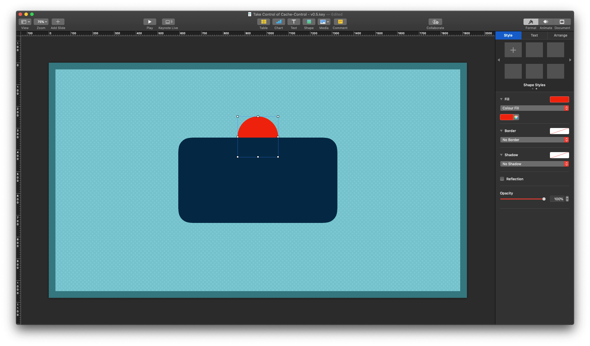
A new, but incredibly helpful feature landed in Apple’s Keynote: Allowing layering with your master templates. This is a great new addition and there have been many cases, where in the past I would have wished this to be possible.
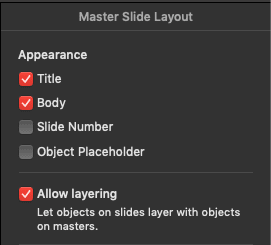
When in View -> Edit Master Slides the Format sidebar options display the new checkbox option:
When you are creating a new slide from your templates, check the new option to allow layering and your normal template will get a new super power.
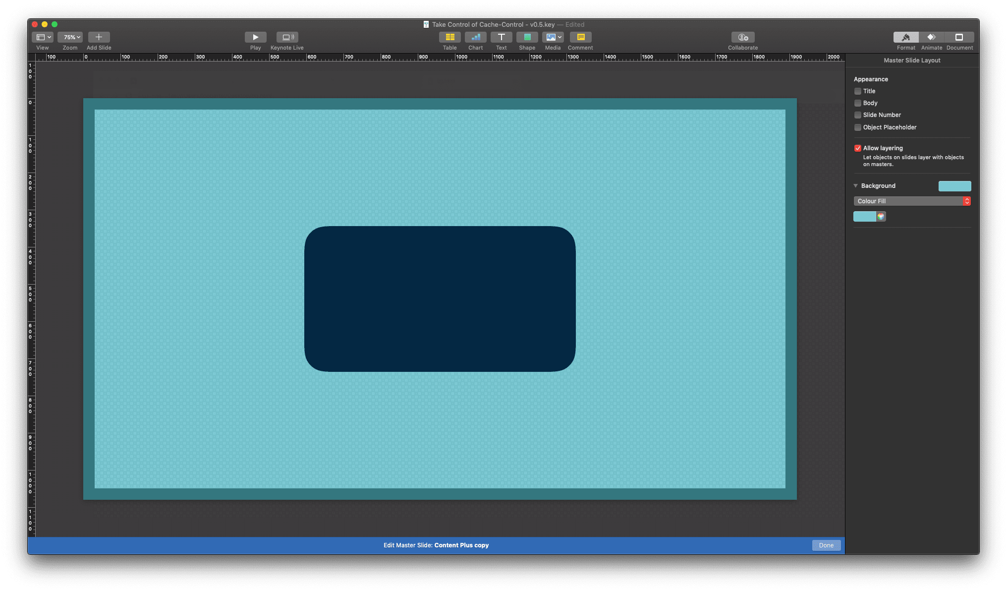
Apple Keynote in "Edit Master Slides" mode
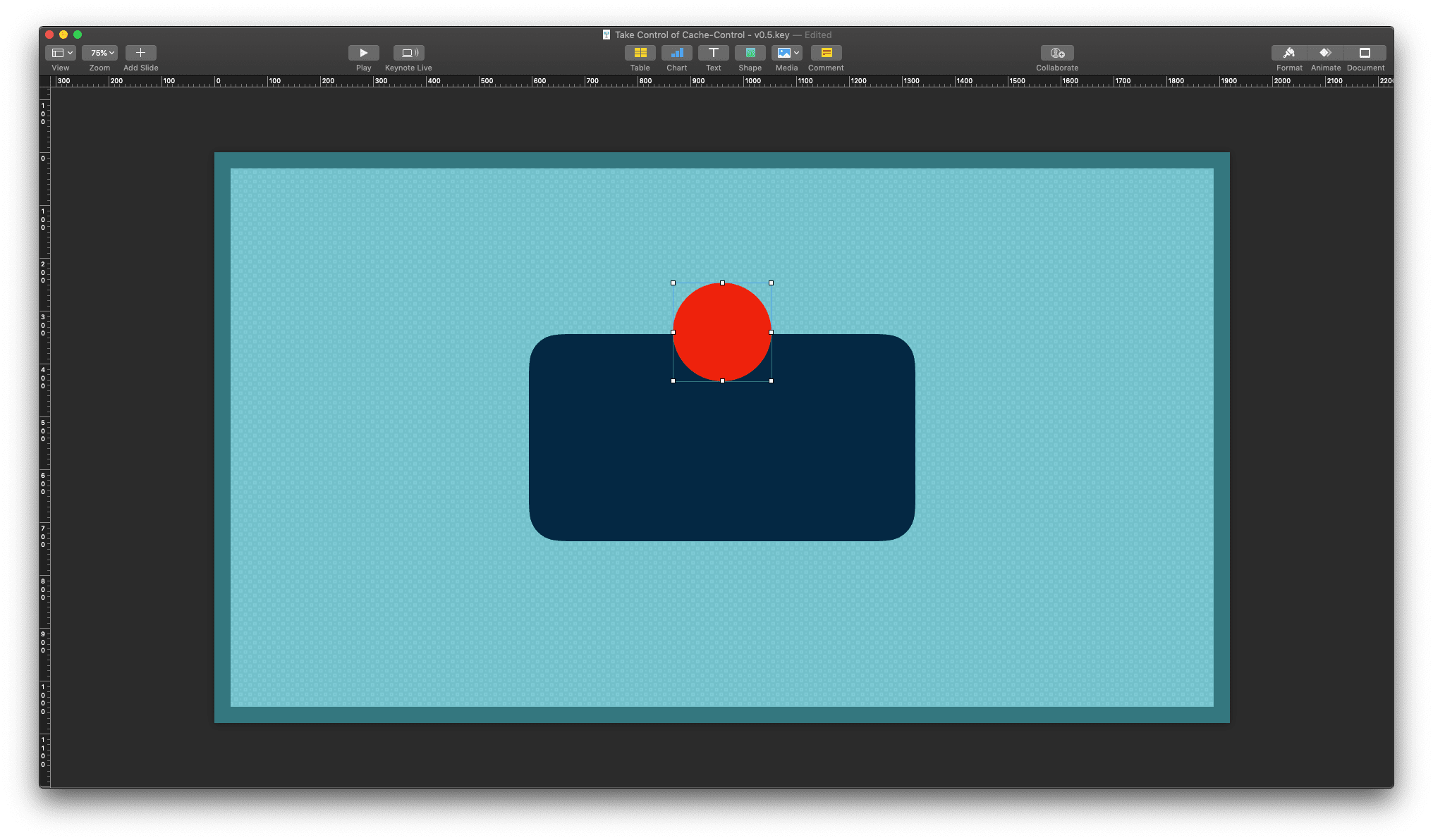
Adding a new object to your template would have meant that it is to stay on its own layer (z-index, or enter other preferred term), without any chance of changing its layer index with your master template objects. There have been many times where I did recreate parts of the master template to be able to move objects in my desired layer order.
Apple Keynote showing a slide based on the master template with a red circle object layered above the master objects
With the new option checked and being able to move objects underneath your master template objects, the hassles of recreating template parts are gone. You can move objects in front of and behind master template objects via the options under the Arrange menu item.
Apple Keynote showing a slide based on the master template with a red circle object halfly layered underneath the topmost master object
Well, the Kirby snippets in V3 do work a little differently now and do require a variable passed to them, otherwise they won't find the variable and hence not work. It took me a little time to actually think that this could have changed. I wish there was a better reference of changes between the versions though.
Not too long ago I started to add some additional security headers to the sites I build. I started doing this on my own site to explore new techniques, but then started to like the idea and a little extra security doesn't hurt.
A problem that I have ran into: When using base64 encoded images in your code and you want to add a Content-Security-Policy (CSP), the image-src directive in the header needs a little extra instruction. It's not enough to declare self or unsafe-inline. Instead, for base64-encoded images, its "scheme" must be allowed.
data:image/png;base64,iVBORw0KGgoAAAANSUhEU…
The data: part in the above is called the scheme, which is similar to a better known scheme like https:. By using this scheme, it needs to be declared in the CSP. It's important to notice that the colon needs to be included, otherwise it won't work.
img-src 'self' data:;
The reason for this little awkwardness is that it's otherwise difficult to distinguish between a 'data' scheme, and a host named 'data'. You can find some more details in the spec.
 Better Text Decoration With CSS’ text-underline-offset