A Different Mobile Navigation Pattern – Made in China

published on
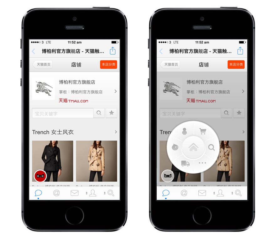
I recently came across the mobile shopping pages of Taobao and noticed their rather not so common approach to their mobile navigation. I'm not quite sure what to think of it at the moment though, but what I do like is that it's something different in a way.
I haven't gone into extensive testing on different devices, but it seems to work fine on iPhone and the MiUI Android browser. Because of the major market share of Android in China, I suspect it works on most other Androids, too.

I do like the positioning and the general direction of this idea, since it allows you to easily reach the navigation without a problem.
Because of its absolute positioning this at the same time might also a problem that this approach faces…
During the workshop we ran at Harbour Front Web Days, we talked about perfect positioning of navigation and showed off where the hard to reach areas for navigation are located. This falls exactly in line with this navigation being positioned in quite a smart way, because it's very easy to reach, (almost) no matter how large your phone is. For larger phones like a Samsung Note 3 or the Xiaomi Redmi Note, this position actually works much better than e.g. a "hamburger" at the top of the page.
Luke Wroblewki wrote about optimizing for touch across different devices quite some time ago and his article best illustrates the different pain points and challenges of navigation positioning on touch devices.
Visit Tmall (This navigation only works on touch-enabled devices it seems)
Visit the mobile site of Taobao (This navigation also works with mouse-clicks)
I think this approach could turn into a solid solution for mobile devices and even might be a future version or replacement for our beloved hamburger menu icon, if done well.
I'm curious to hear your thoughts on this approach. Let me know!